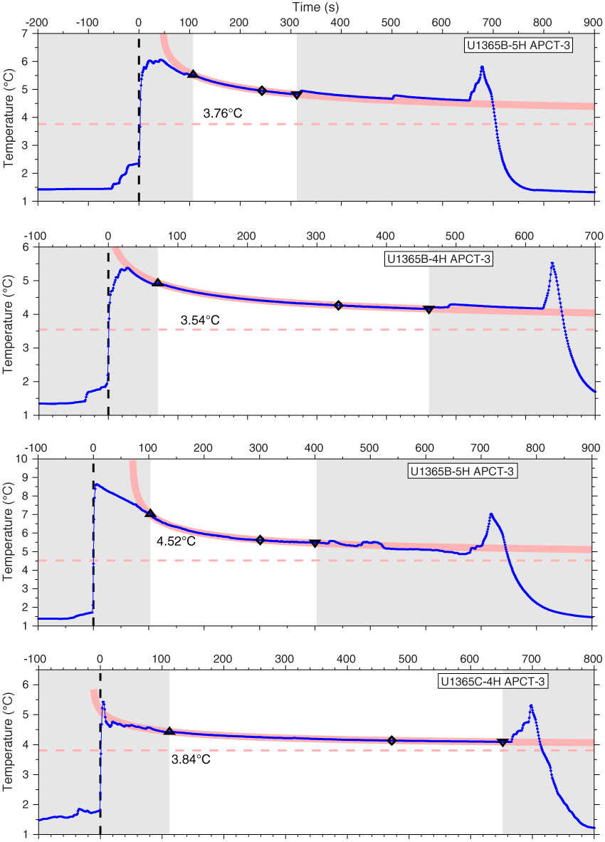
Figure F47. Diagrams of temperature-time series measured during deployment of the advanced piston corer temperature tool (APCT-3), Site U1365 (blue line). Unshaded area shows data used for equilibrium temperature fit. Red line shows theoretical equilibrium curve. Triangle shows beginning of fit and inverted triangle shows end of fit. Dashed red line with circles shows estimate of equilibrium temperature.
Previous | Close | Next | Top of page